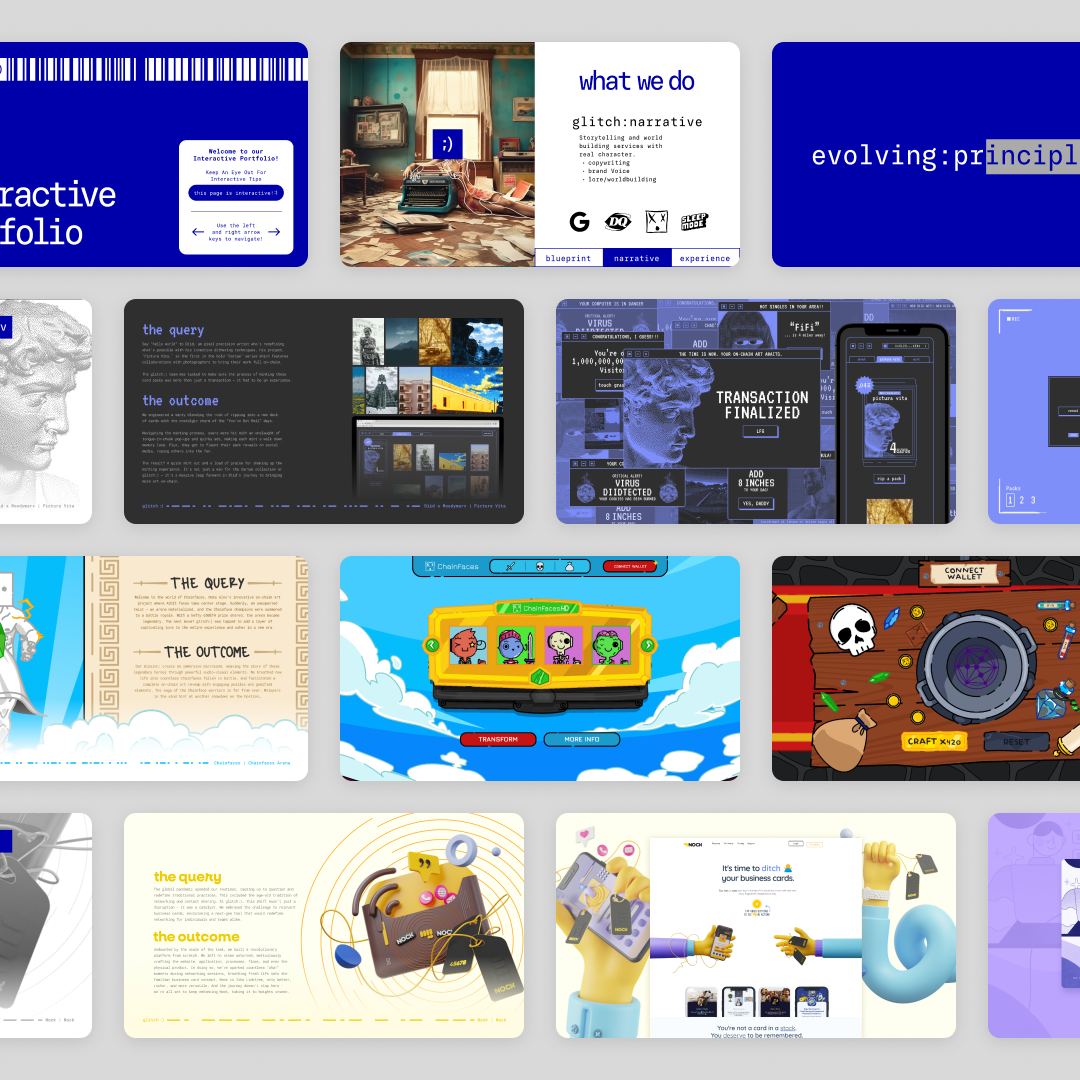
McAllen Foreign Trade Zone 12 and their Intermodal department needed a modern, distinctive brand identity to stand out in a sector dominated by traditional designs. Their previous logos were outdated and lacked visual differentiation, making it difficult to convey the professionalism and versatility of their operations to industry partners and global stakeholders. As a collaborator with Glitch Creative Labs, I developed refreshed logos and a responsive branding system for both McAllen FTZ 12 and Intermodal, ensuring clarity, flexibility, and visual distinction between the two entities.
The Outcome
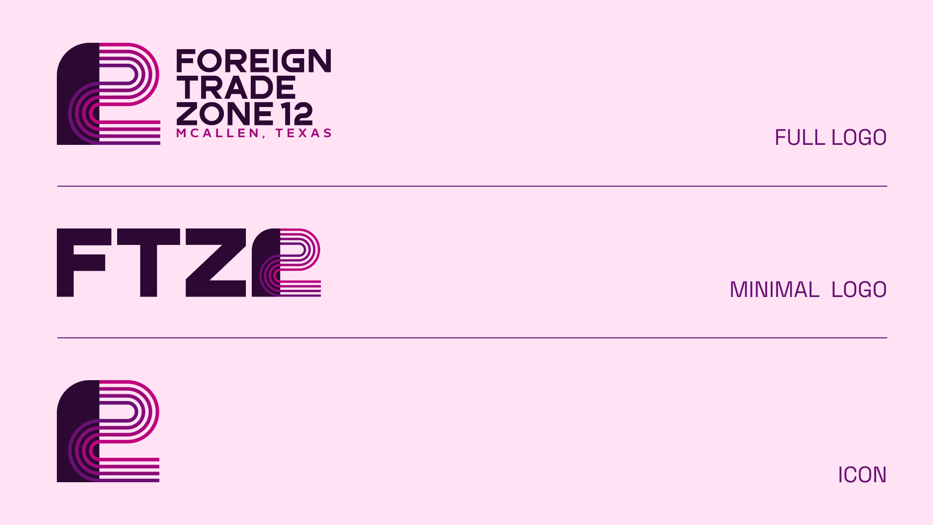
For McAllen FTZ 12, I designed a logo where the “12” combines a solid fill with a line-filled “2,” referencing the various modes of transportation used while creating a bold, modern visual. A purple and magenta colorway further distinguished the brand from the conventional blues of other foreign trade zones. The logo is fully responsive, allowing flexibility across applications and scales. For the Intermodal Department, I created a minimal bridge logo that echoes the lines in the “2” of the FTZ 12 logo while remaining distinct. Its yellow and orange palette signals a separate identity while maintaining cohesion with the overall branding system. This logo also benefits from a responsive design system for consistent application.
The Impact
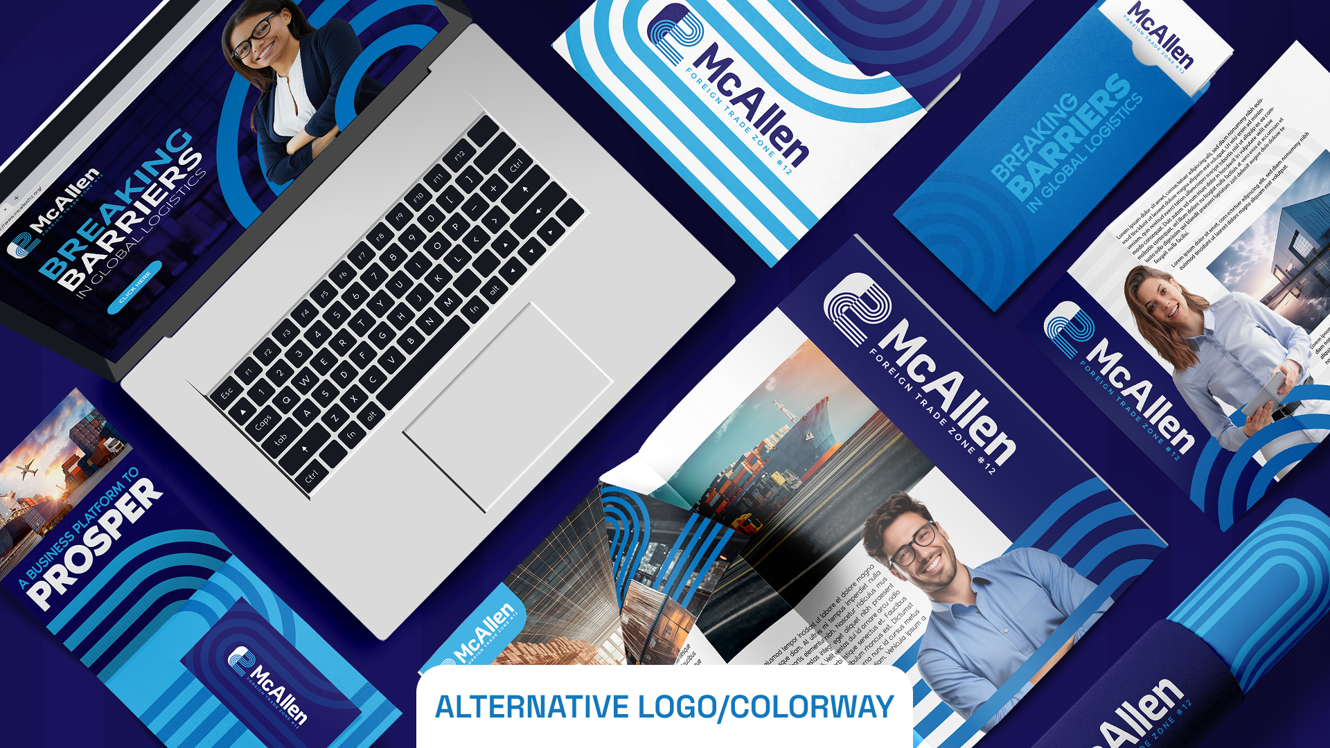
The refreshed logos and branding system were extremely well-received and are now actively used across McAllen FTZ 12 and Intermodal’s website and social media channels. The designs modernized their visual identity, helped them stand out to industry partners and global stakeholders, and provided a flexible system for consistent application across multiple platforms.


.svg)


.svg)


.svg)